SITE Santa Fe
Client
SITE Santa Fe
Services
Brand Identity
Creative Direction
Year
2022-ongoing
SITE Santa Fe is a space for contemporary art curated by Louis Grachos and team.
Among his pioneering achievements as a curator in the early 90’s was the creation of a biennial of North American avant-garde art at SITE Santa Fe. This turned Santa Fe into a focal point of exchange between the international art world and the local community in New Mexico –– a legacy that still holds up today.
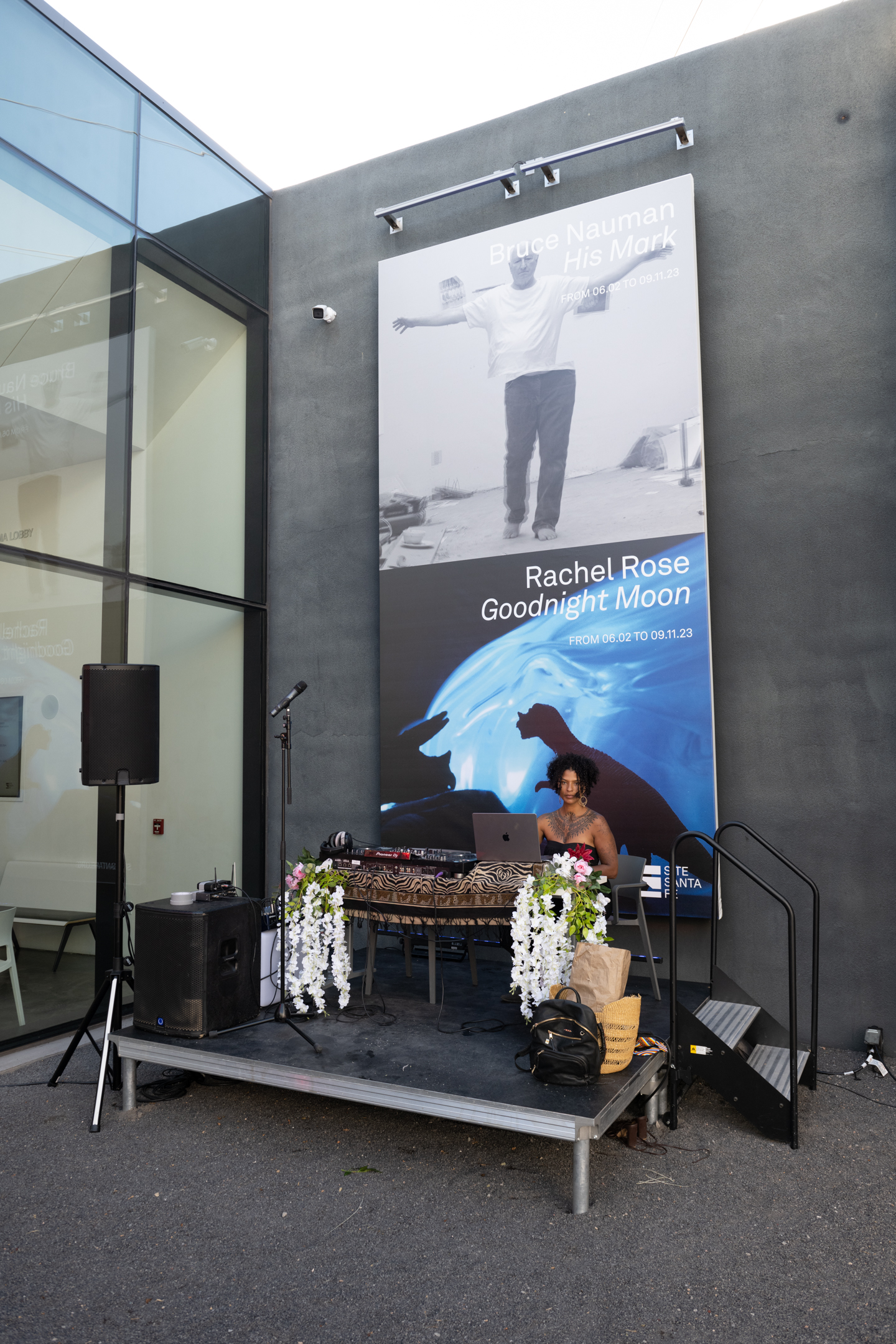
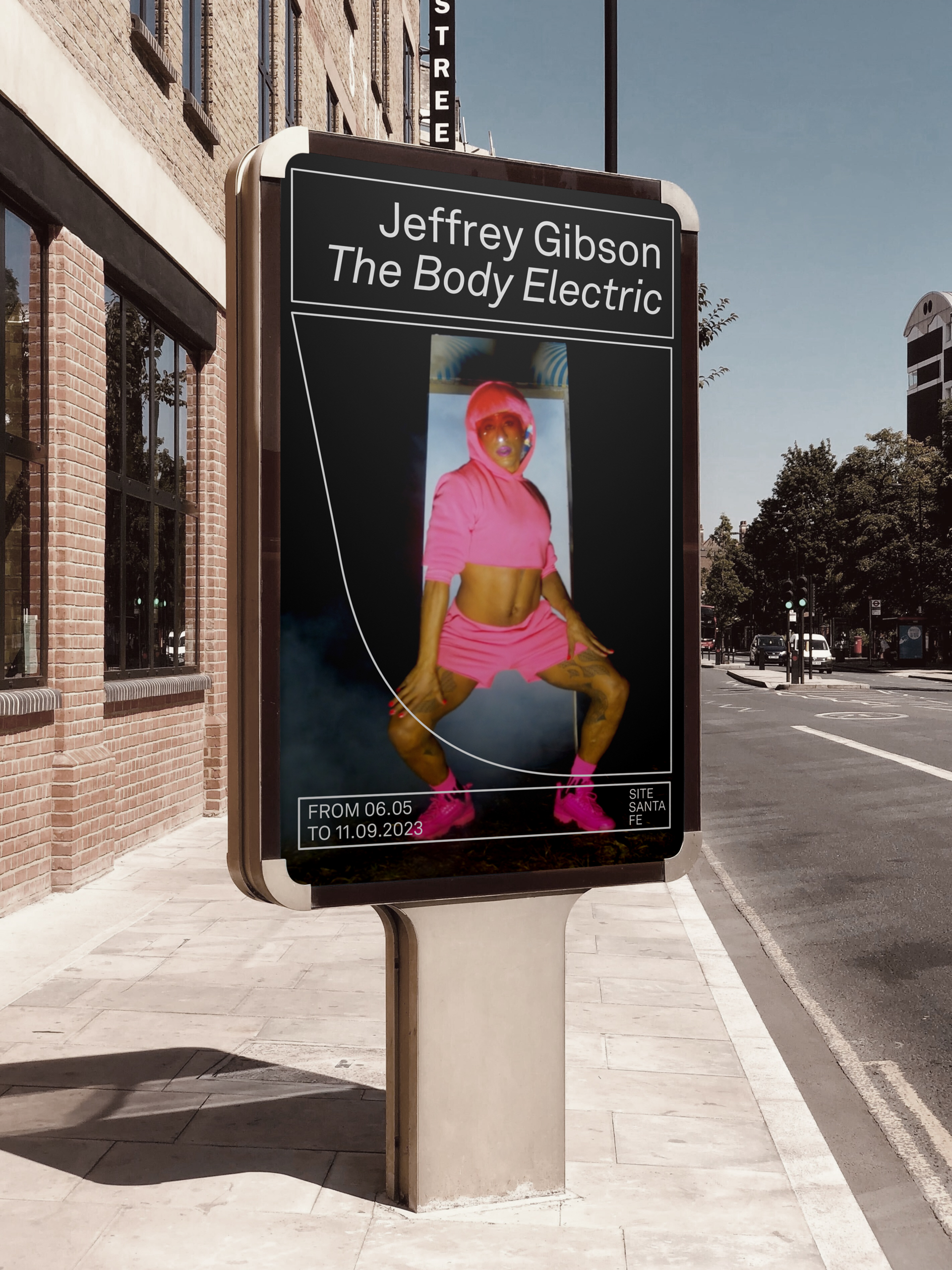
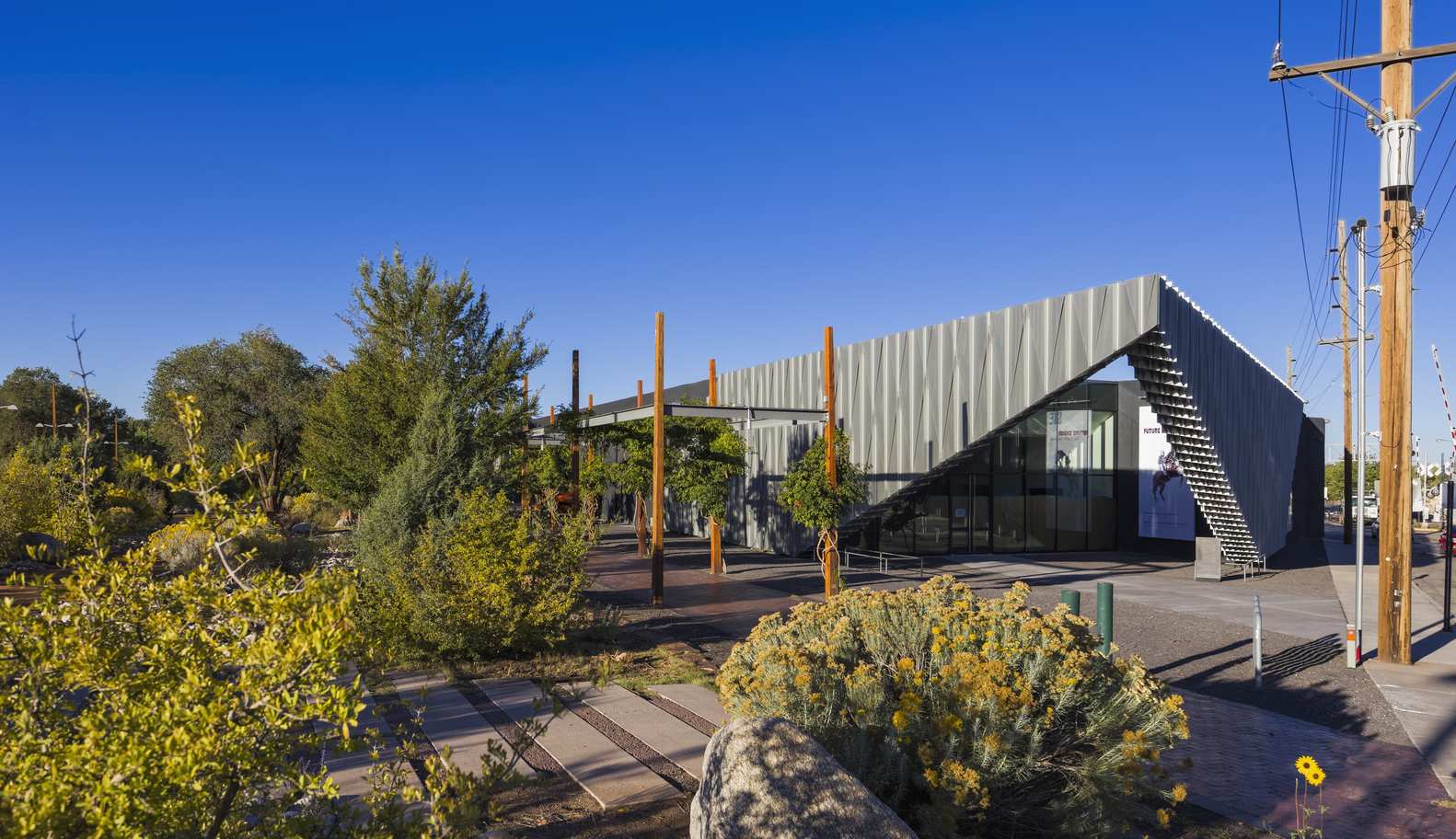
SITE Santa Fe is located in a highly modern building that stands out from the typical local architecture. This façade was practically the sole visible face of the space, along with a logo from the early 2000s. Hence, the need to create a robust and new brand identity, with a design capable of generating greater visibility that would strengthen the connection with the local community, and continue to demonstrate SITE as a leading player in the global art scene.
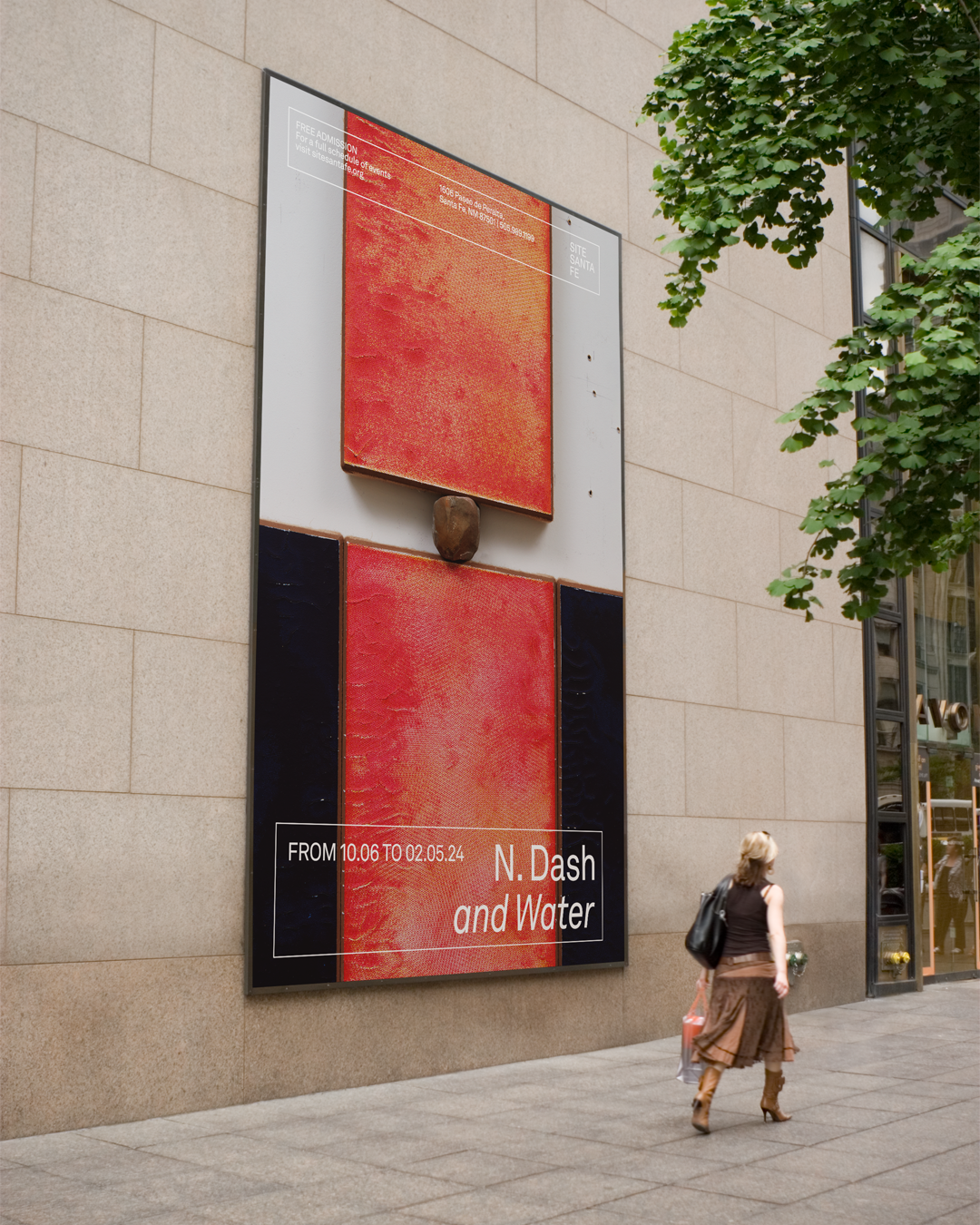
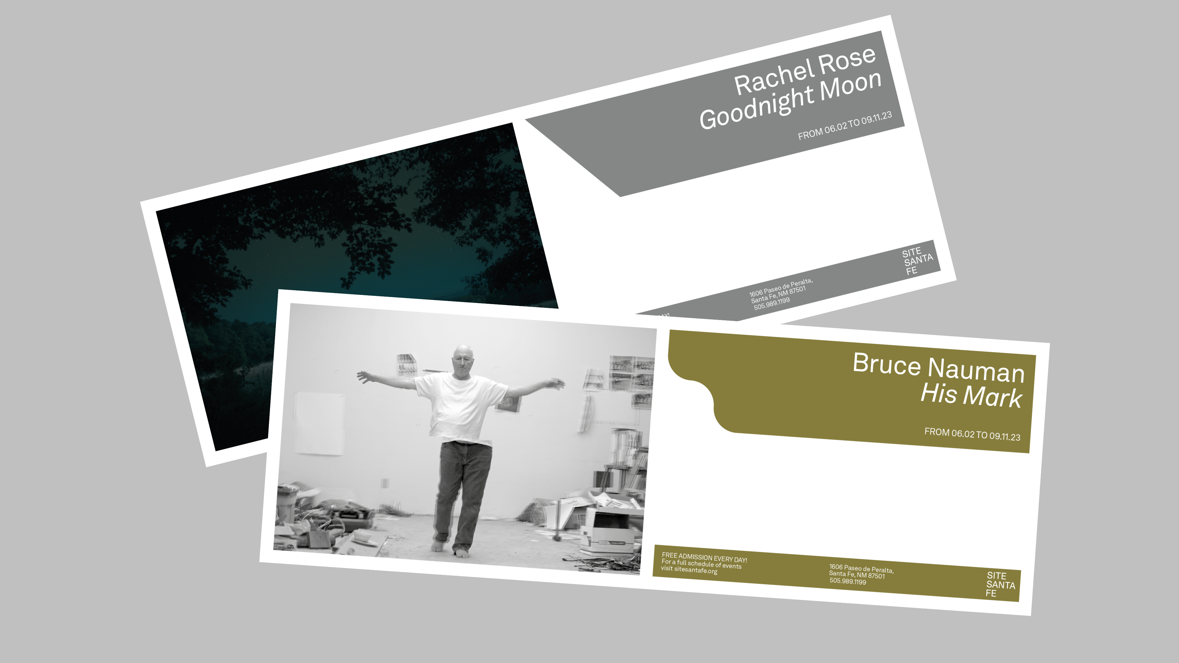
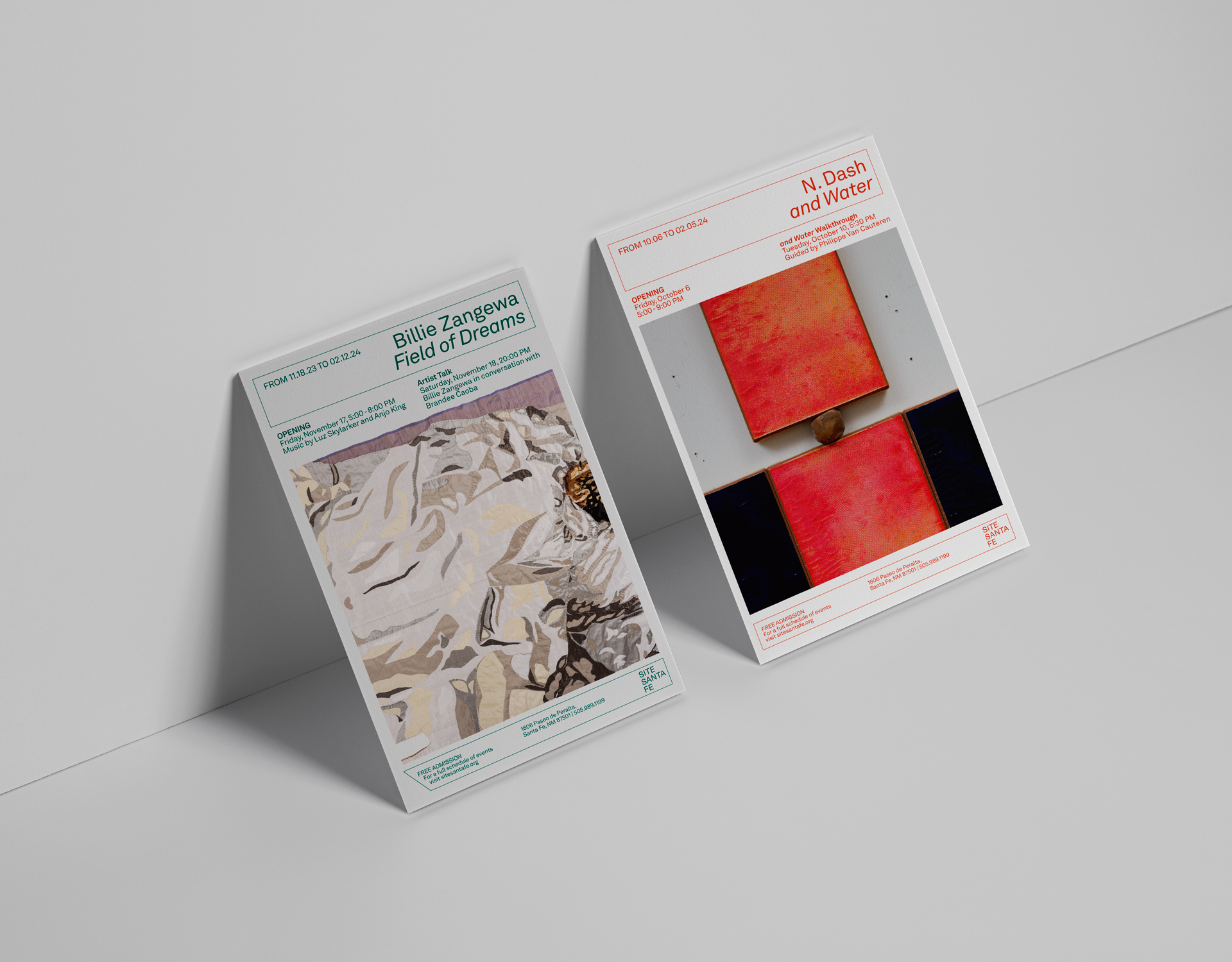
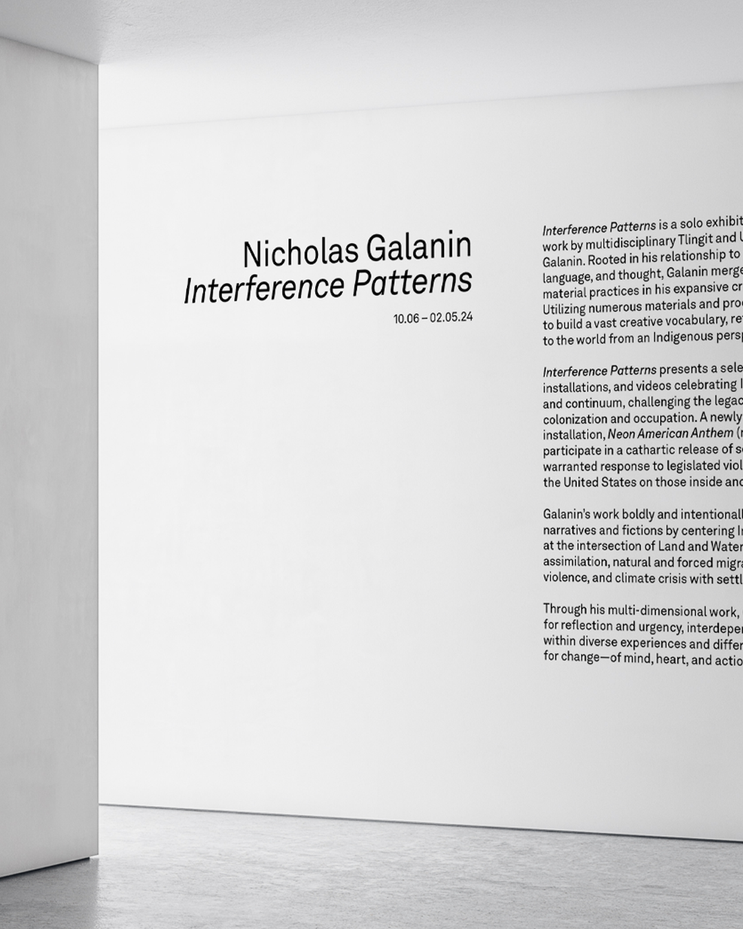
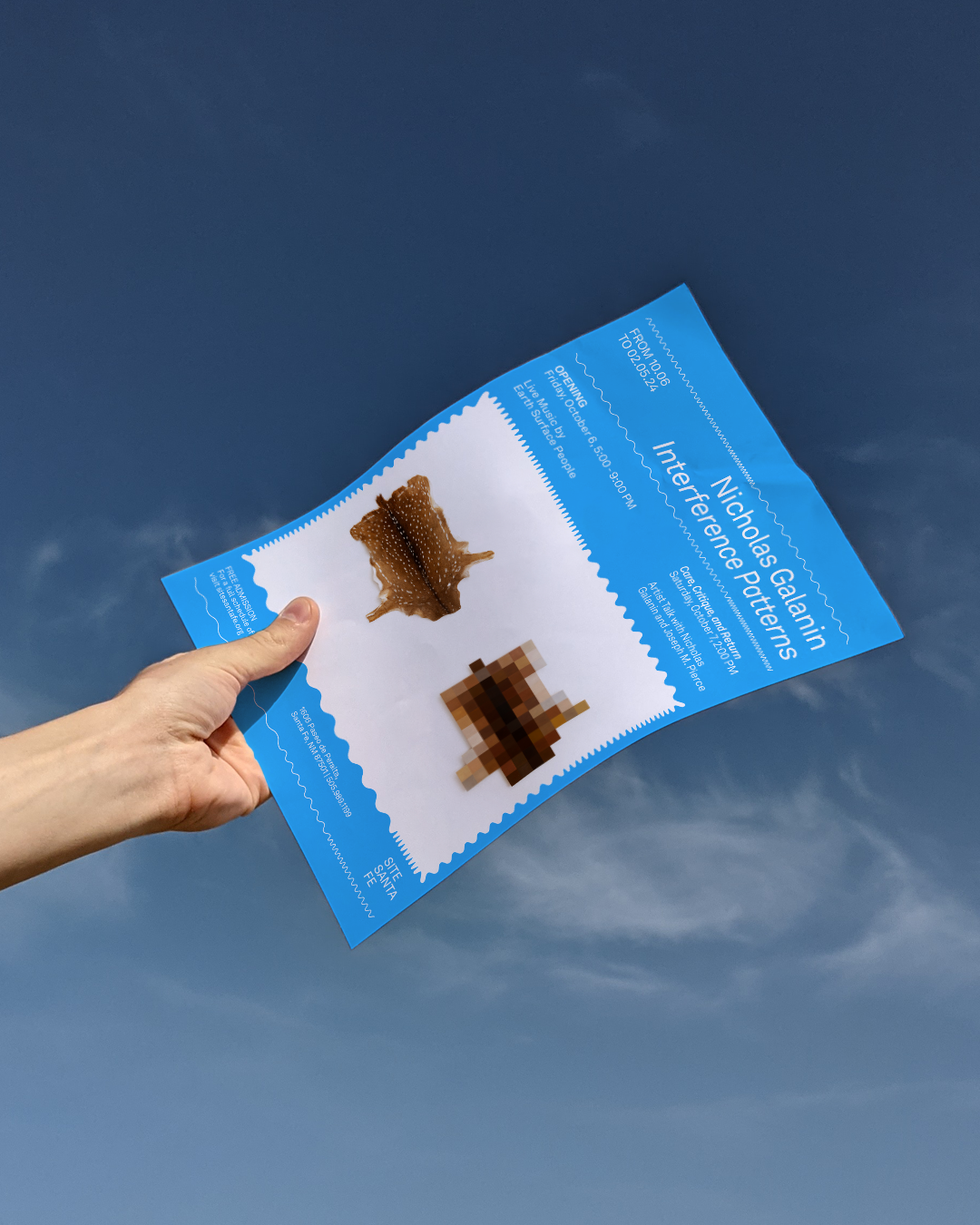
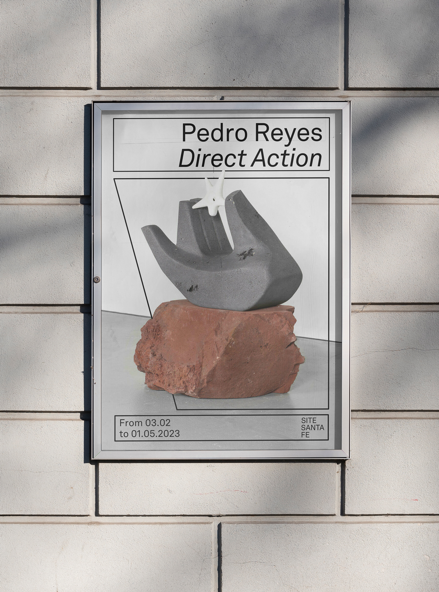
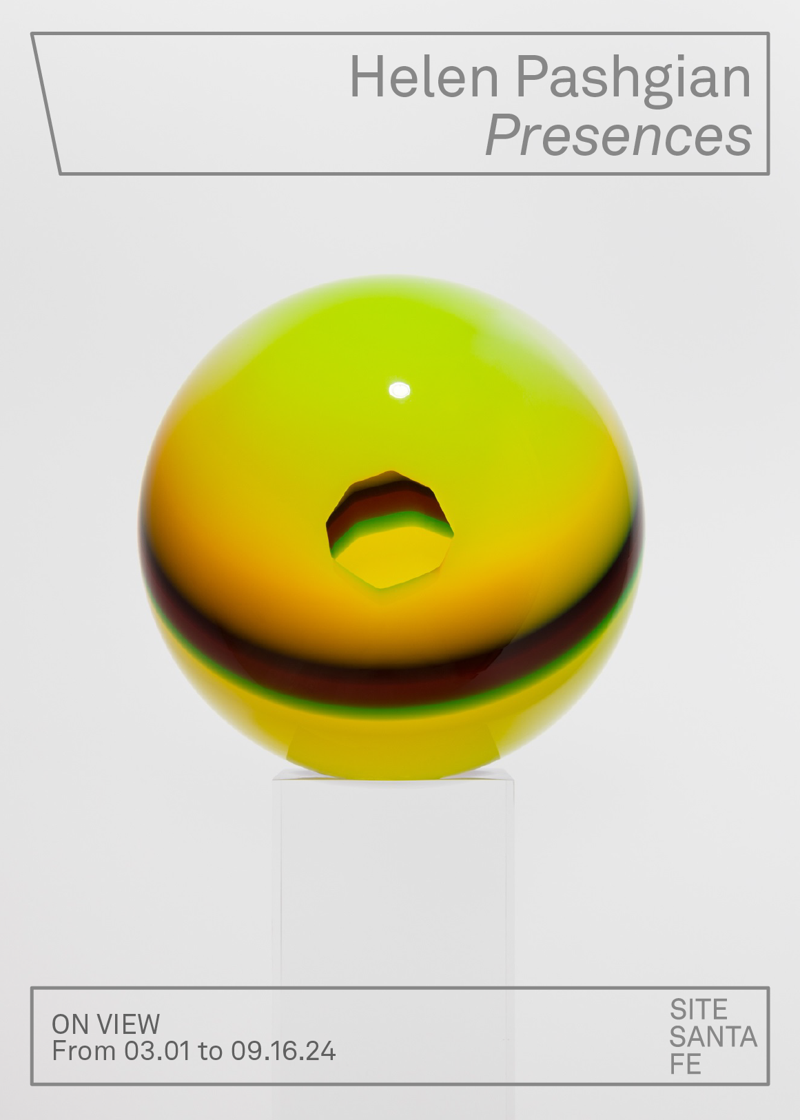
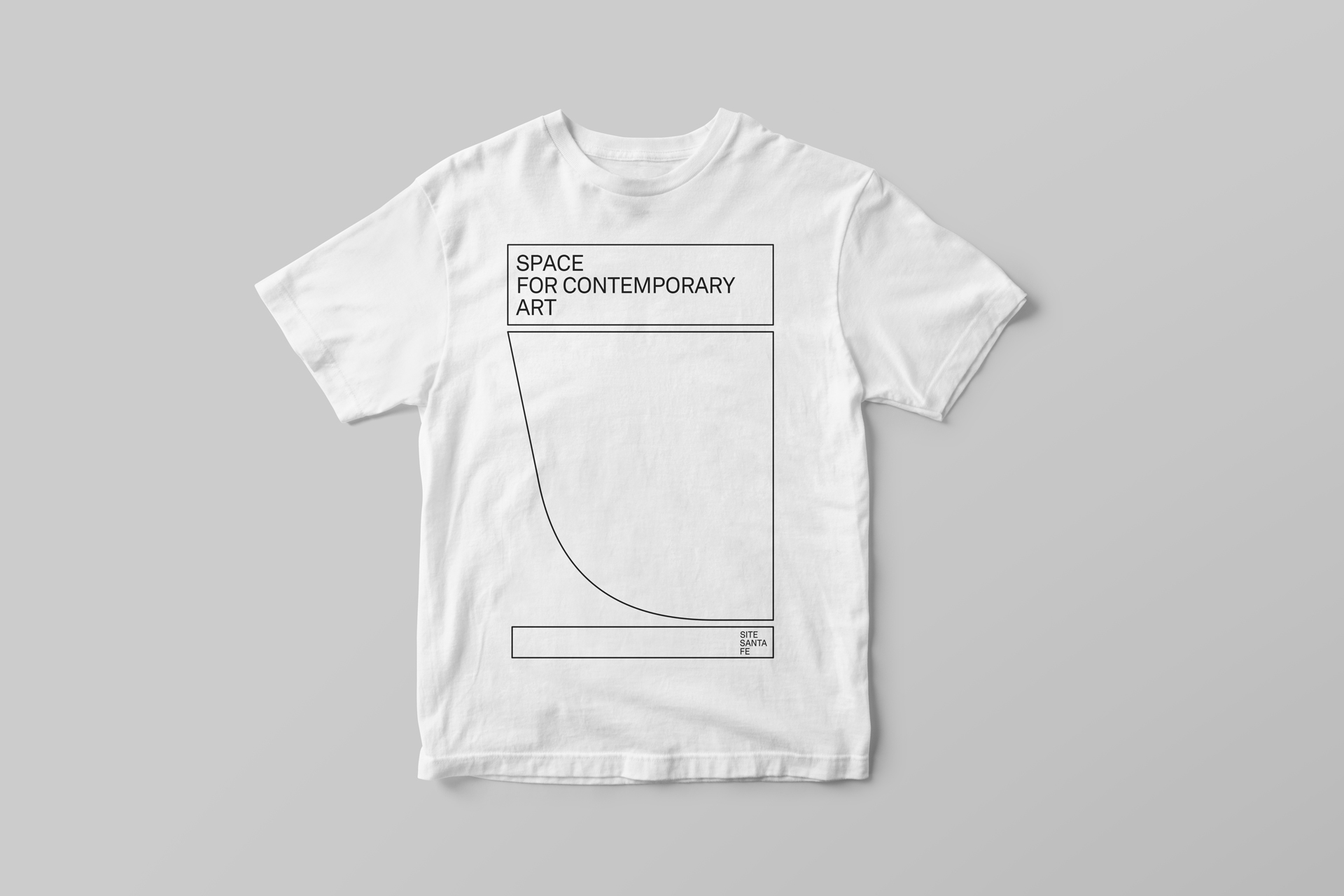
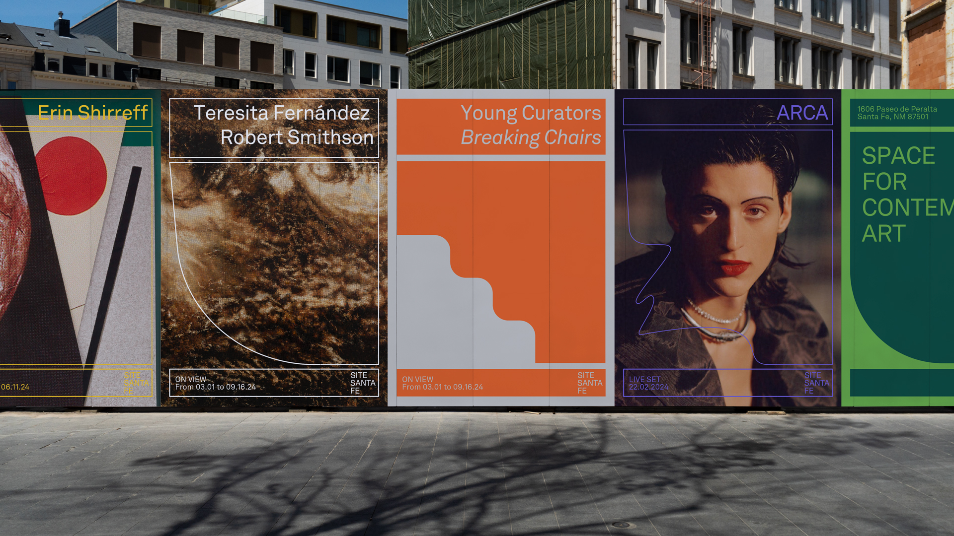
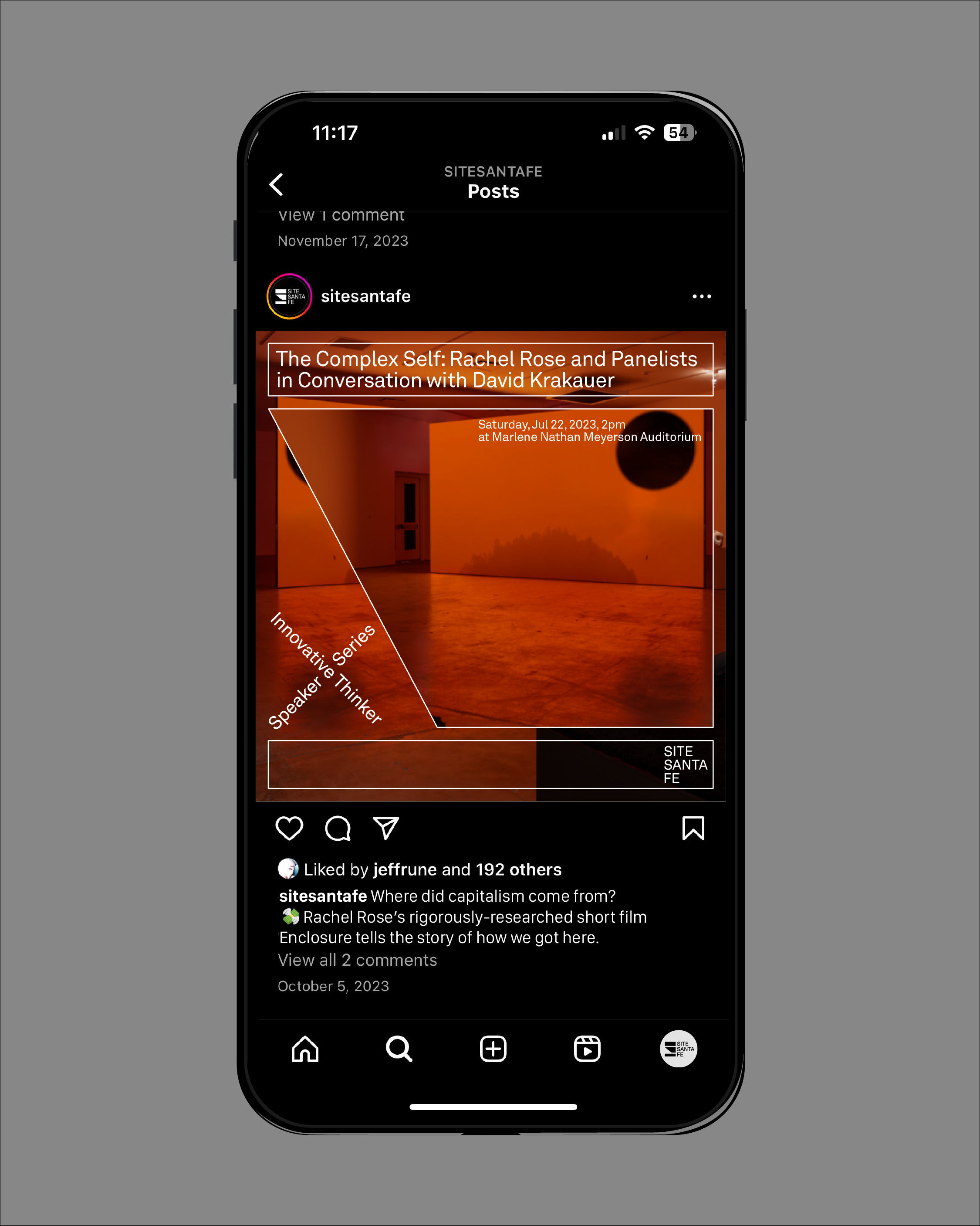
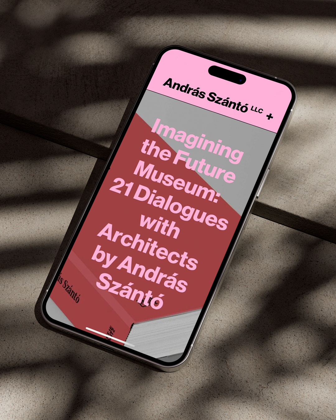
In a collaborative effort with András Szanto LLC and SITE’s internal team, we were invited to undertake the rebranding and development of a graphic system that would address multiple key aspects. These included user re-thinking user experience during museum visits, new signage work, web development, merchandise, stationery, printed materials, and social media.
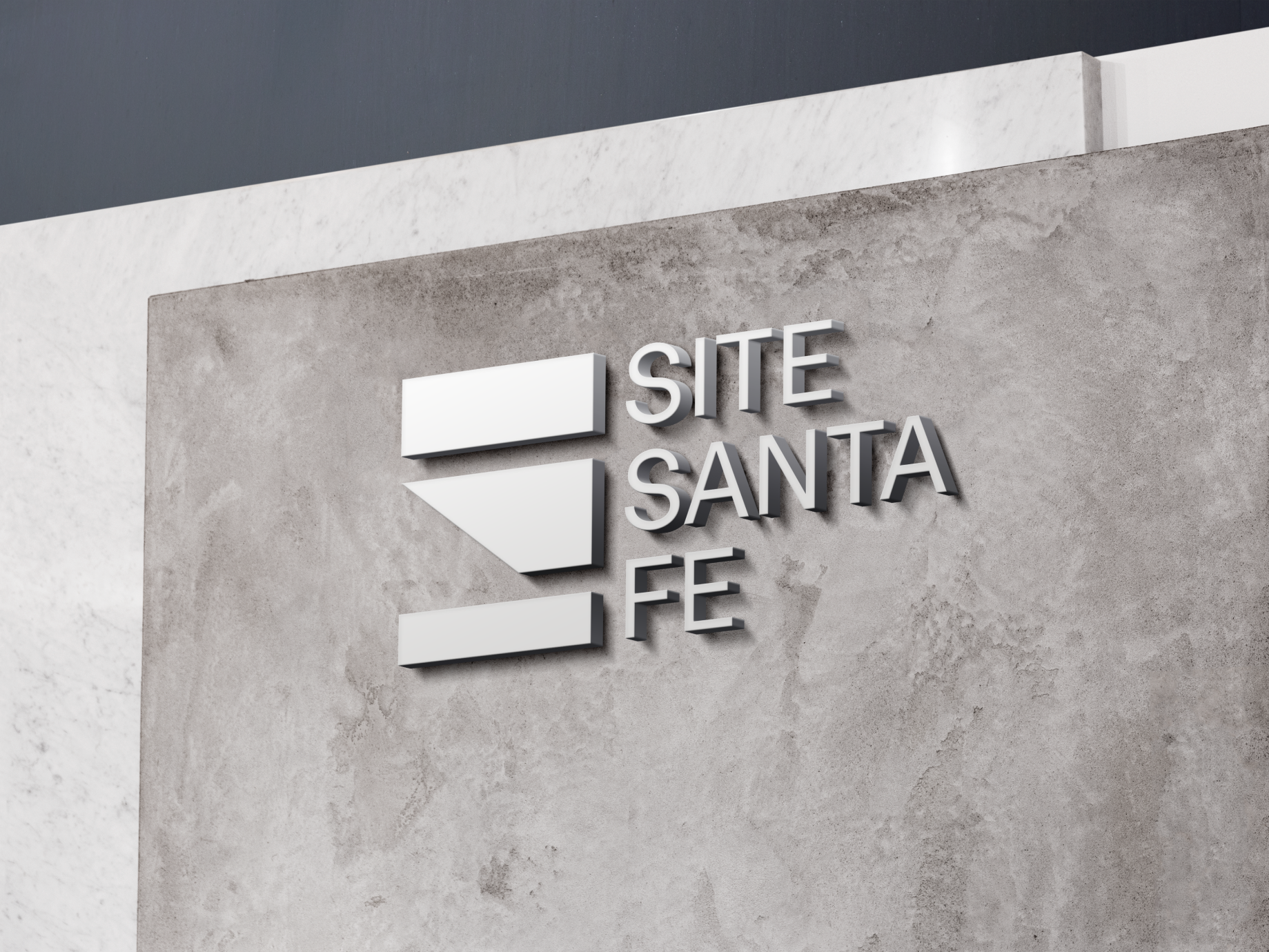
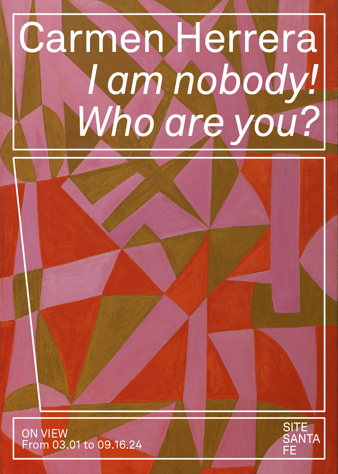
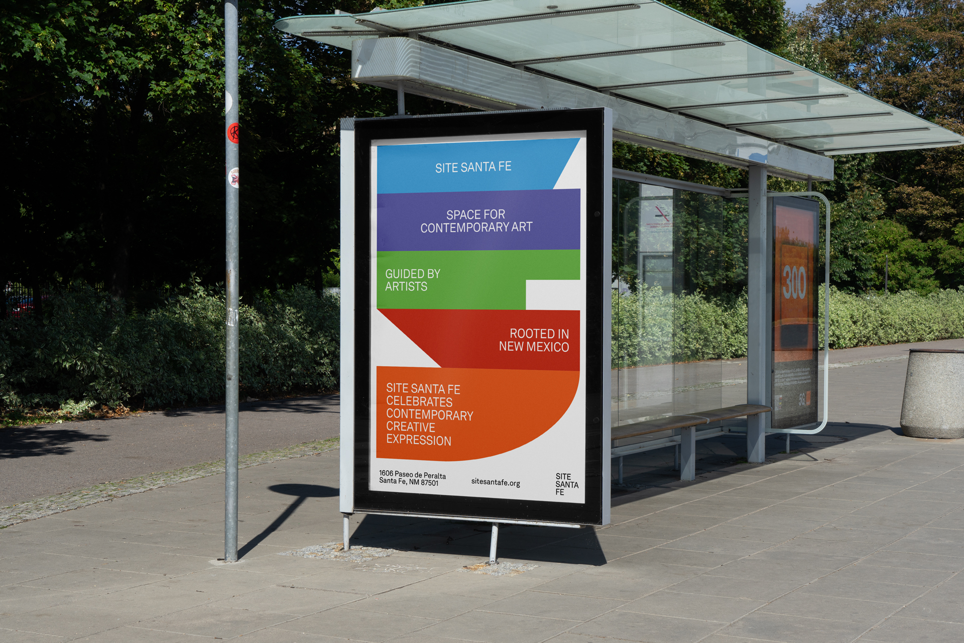
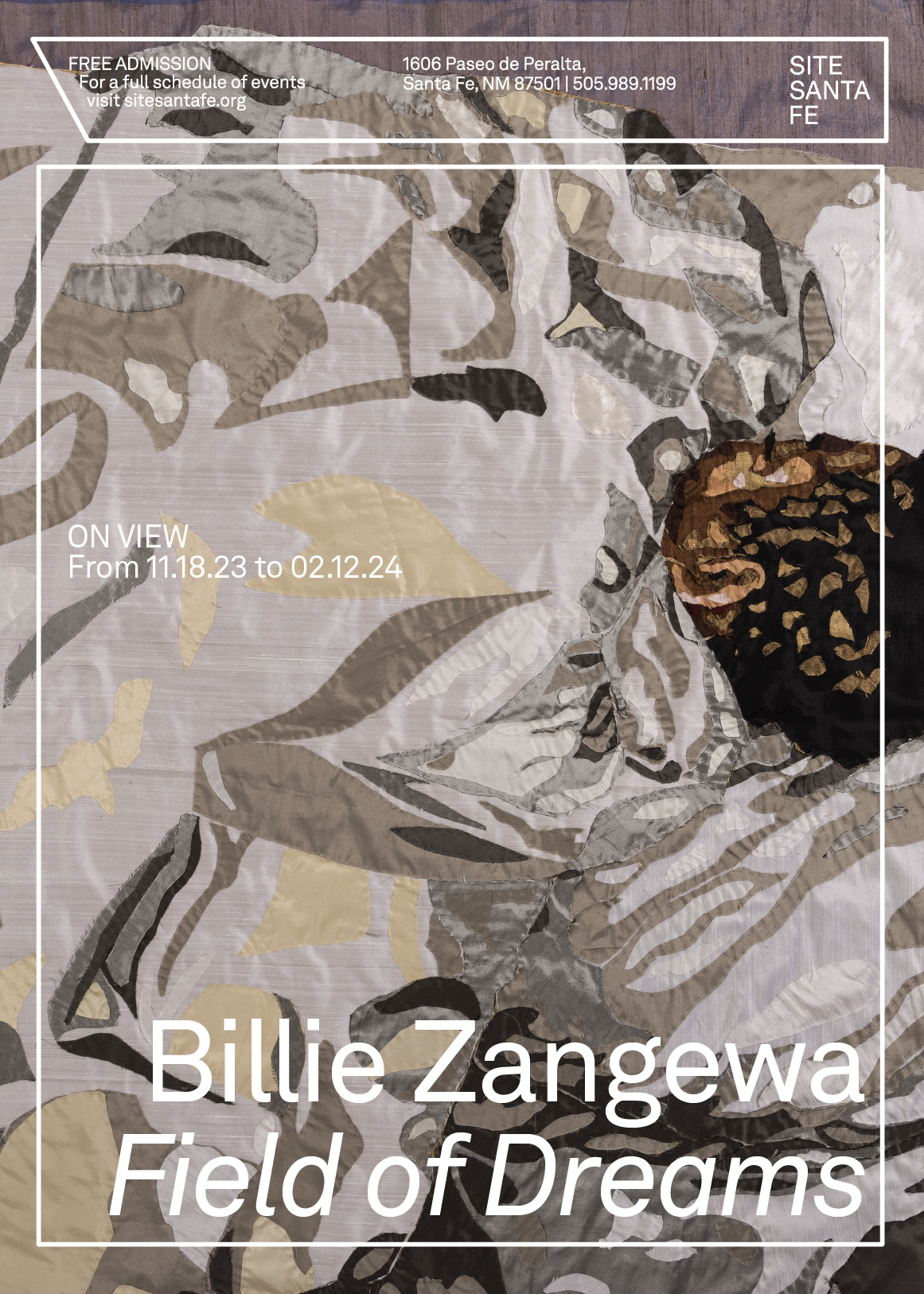
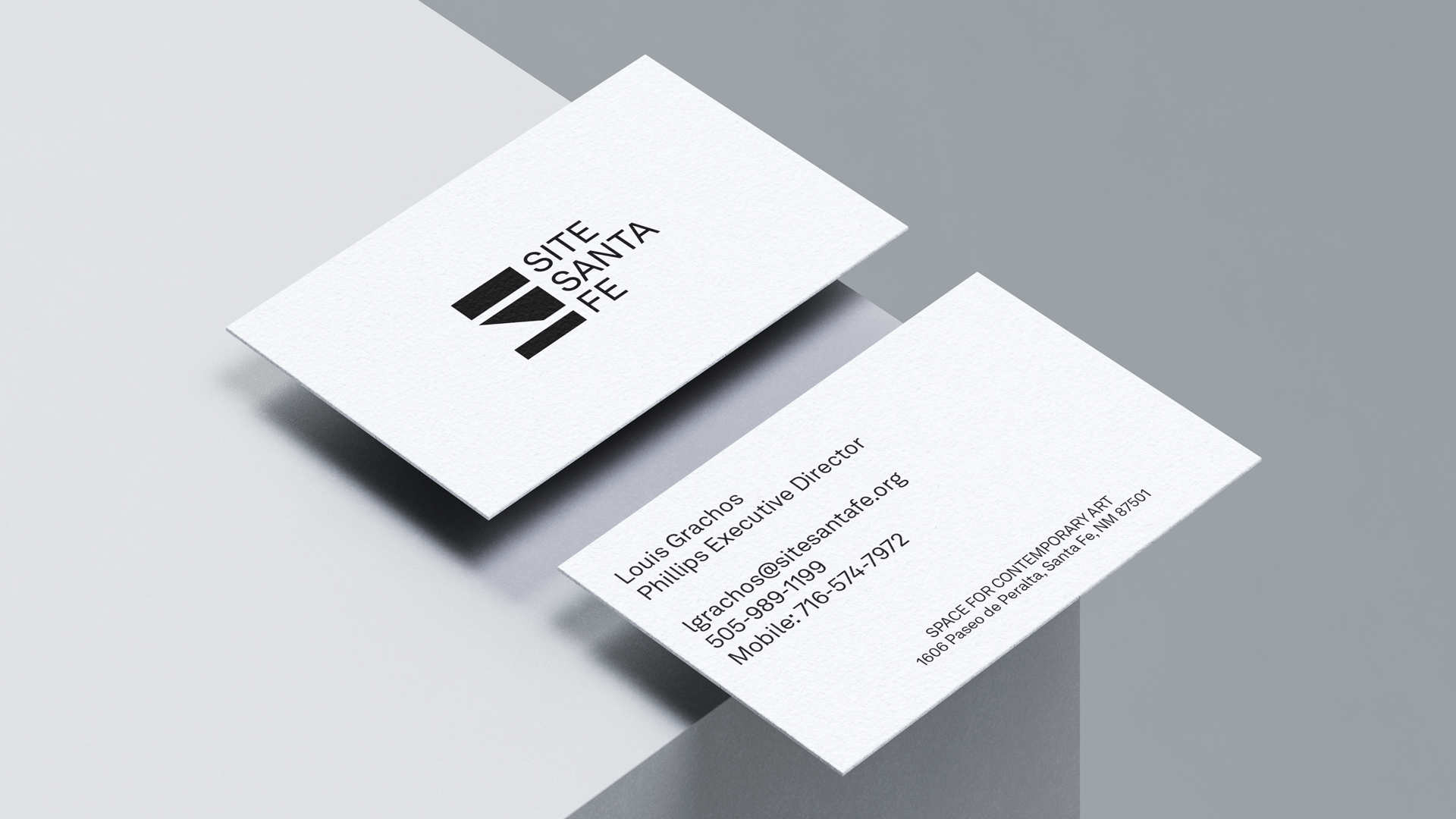
The three blocks allude to the flexibility of the space, a space whose greatest attribute is the possibility of change and constant reinvention, while maintaining its root mission to be a space that welcomes visitors with kindness and tolerance. The simplicity of the upper and lower cubes are complemented by the movement and constant rhythm of the middle block, which can act in a solid form or in a contoured version. The typographic application refers to the timelessness and flexibility of the space, and the use of Akkurat LL reminds us of its neutrality, creating the precise ambiance to focus on what is most important for SITE Santa Fe: art.
The use of color is derived from the local environment: New Mexico is marked and enveloped by its mountains, and we wanted to capture the earthy tones to connect the space with the territory and the community.
The culmination of this project is the re-representation of the space, which is many things at once. The straight lines coexist with the flexibility of artworks, all of which, together, warmly welcome and embrace everyone who wishes to be part of it: visitors, workers, students, the Santa Fe community, artists, and curators.
Design Direction:
Simón Sepúlveda, Piedad Rivadeneira
Creative Direction:
Simón Sepúlveda
Brand Strategy:
Andras Szanto LLC
Laura Noguera
Graphic Design:
Pau Geis, Antonia Guzmán, Vicente Acuña
Motion Design: Antonia Guzmán, Alexandre Marqués, Sandra Serra
Project Manager:
Deborah Vazquez
Web Design:
Camilo Roa
Developers: AMA, Carlos Salvador, David Peñuelas
SITE Santa Fe crew: Carolina Franco, Louis Gracho, Rica Maestas, Clara Samayoa
Case Study Photography: SITE Santa Fe
Fonts: Akkurat LLC
